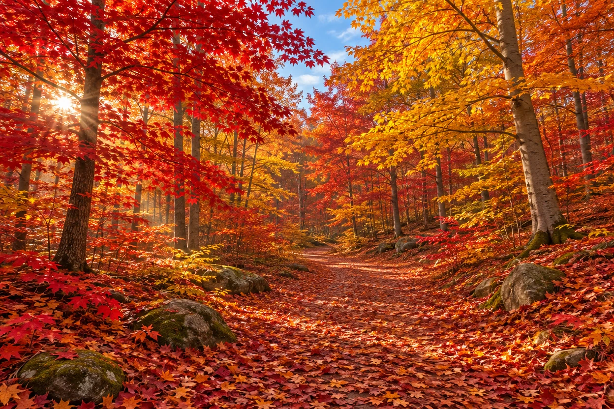
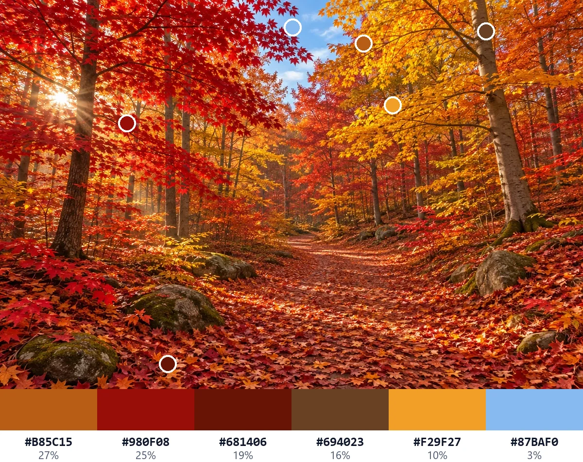
Autumn forest
MainBurnt orange, deep red, rust and brown, with a touch of golden yellow and blue sky.
#B85C15#980F08#681406#694023#F29F27#87BAF0
Open a photo or an illustration and get its color palette from image pixels in seconds: the main colors with their share of the picture, in the mood you choose. Drag a mark to take any color from another spot, then copy the HEX codes or download the palette for your design app. Free, and nothing is uploaded.
Drop a picture here
Or paste one with Ctrl+V. JPG, PNG, WebP, GIF, AVIF or BMP, up to 40 megapixels. Nothing is uploaded.
Each color palette from image below was made by this tool from its picture, in the mood shown on the card. Open one to change the mood, the number of colors or any single color.
Burnt orange, deep red, rust and brown, with a touch of golden yellow and blue sky.
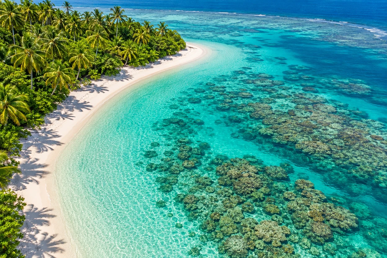
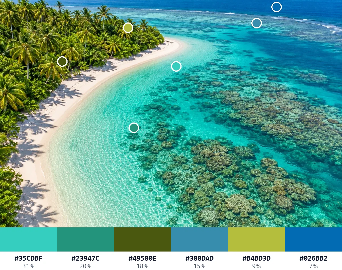
Vivid picks out turquoise, teal and ocean blue with the bright greens of the palms.
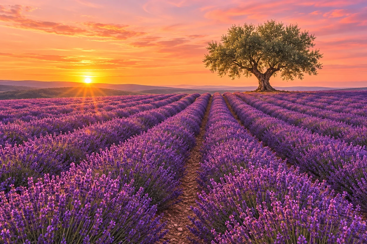
Plum and mauve from the lavender, with peach and coral from the evening sky.
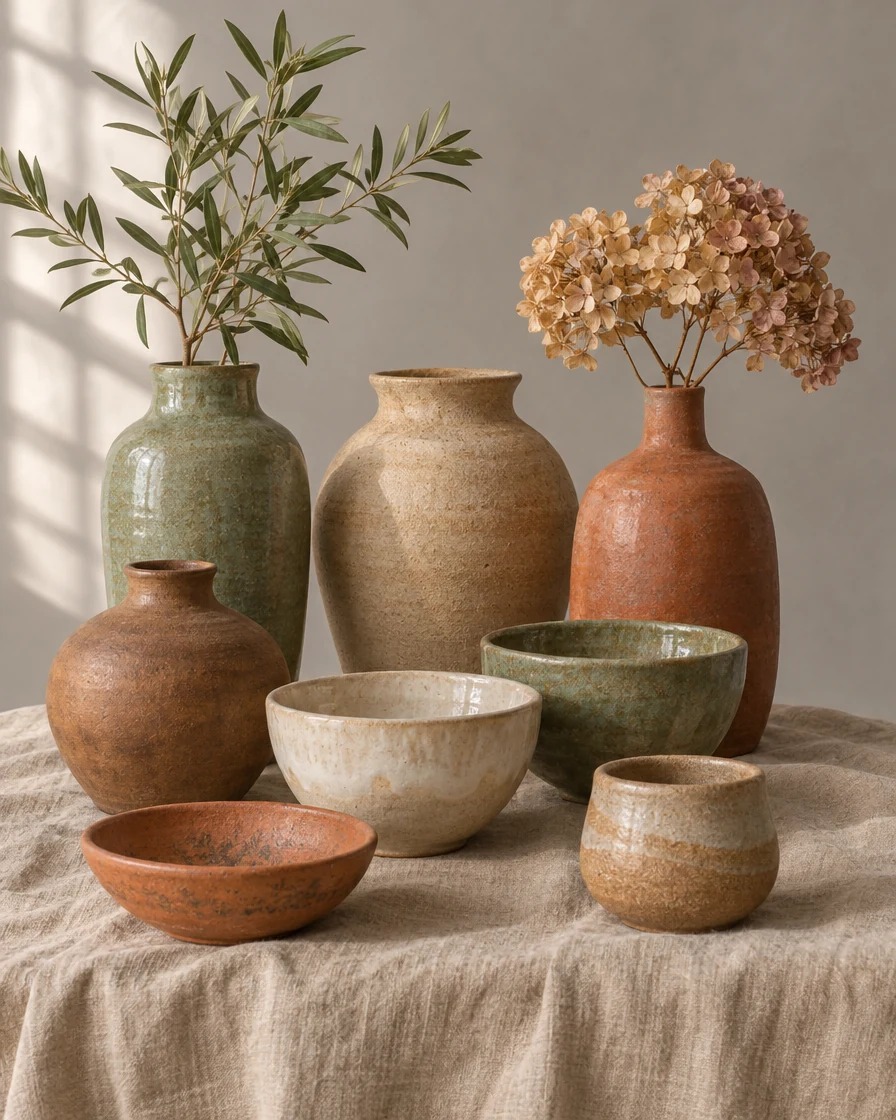
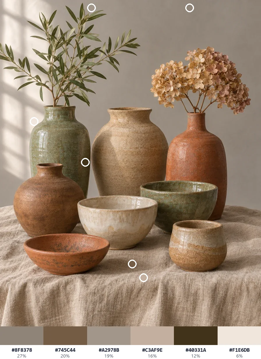
Muted gives the soft clay, sand, oatmeal and earth tones of the glazes.
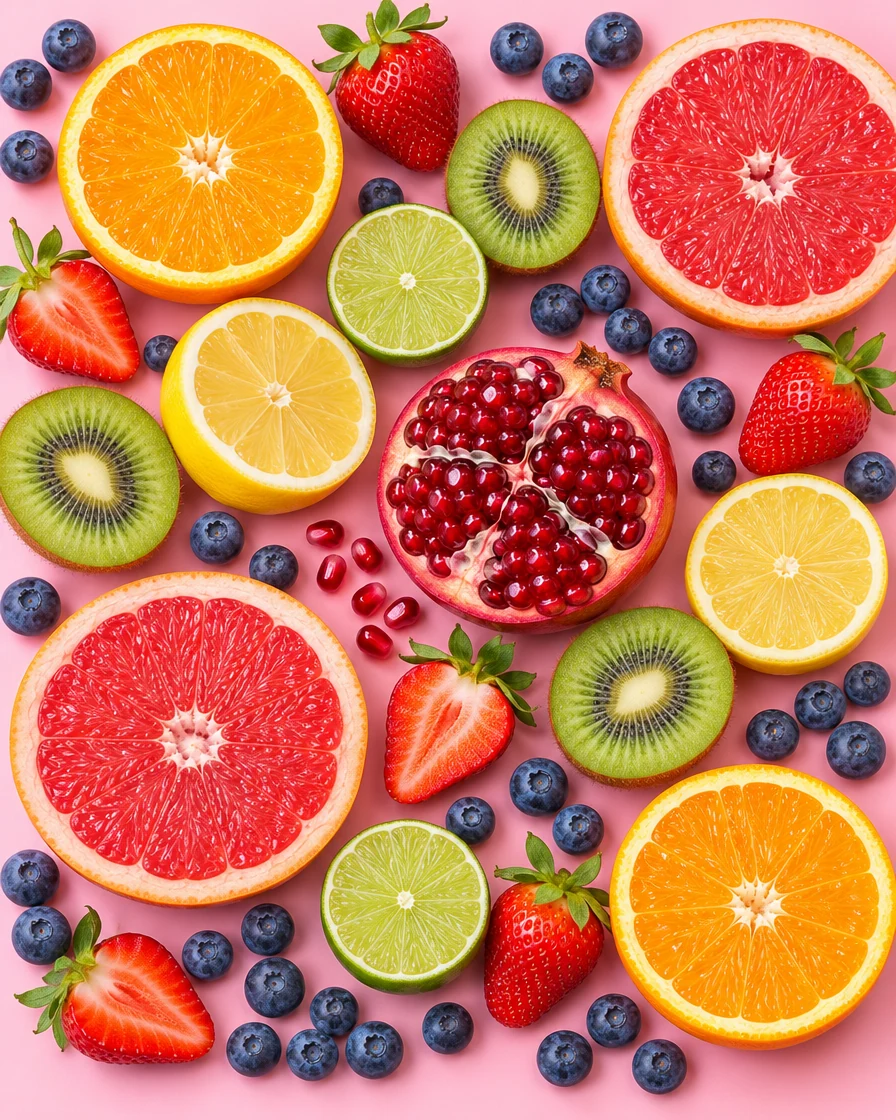
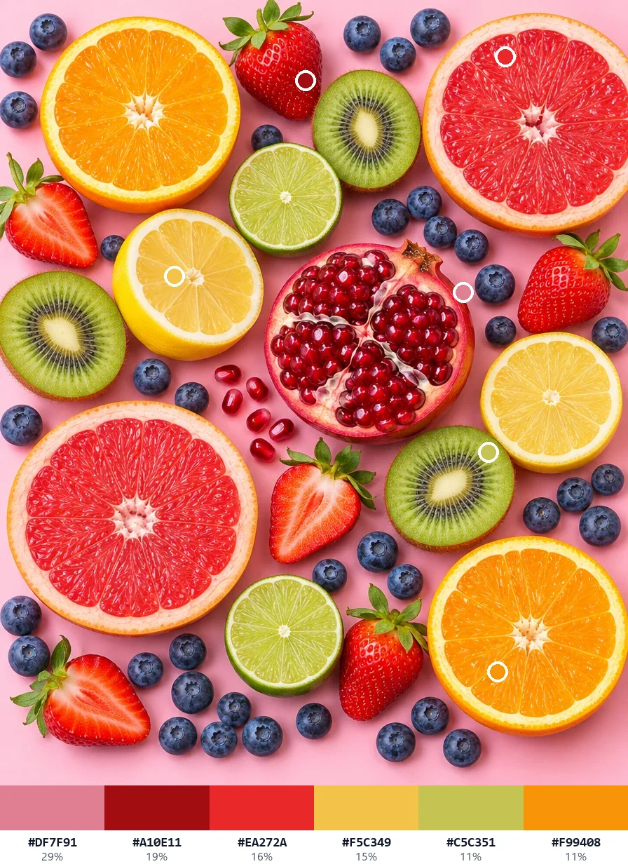
Vivid brings out pink, crimson, red, lemon yellow, lime green and orange.
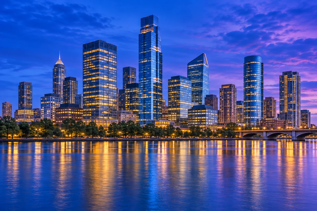
Dark gives deep cobalt, navy and night violet, ready for a dark theme.
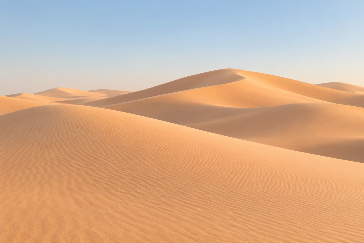
Light keeps the apricot, sand and cream of the dunes with the pale blue sky.
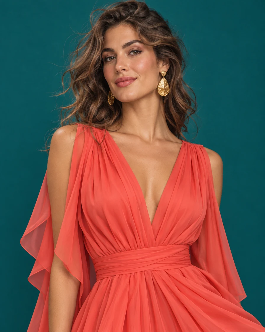
The deep teal wall and the coral dress, with warm skin and hair tones.
Three steps, all in your browser.
Drop a photo, an illustration or a screenshot, choose a file or paste one with Ctrl+V. The palette appears at once.
Keep the main colors or switch to Vivid, Muted, Light or Dark, set 3 to 12 colors, and drag a mark on the picture to swap any color.
Copy the HEX codes, CSS variables, Tailwind or JSON, or download the palette for Adobe apps, Photoshop or GIMP, or as a PNG swatch card.
It reads every pixel of your picture and builds a palette of colors that are really in it.
Each color of the palette is one the picture actually has, never an average of several, so a coral dress stays coral and a teal wall stays teal.
Main gives the colors that cover most of the picture. Vivid, Muted, Light and Dark pick its brightest, softest, palest or deepest colors, for every kind of design.
Every color has a mark on the picture. Drag one to another spot and the palette takes the color there, with every share worked out again.
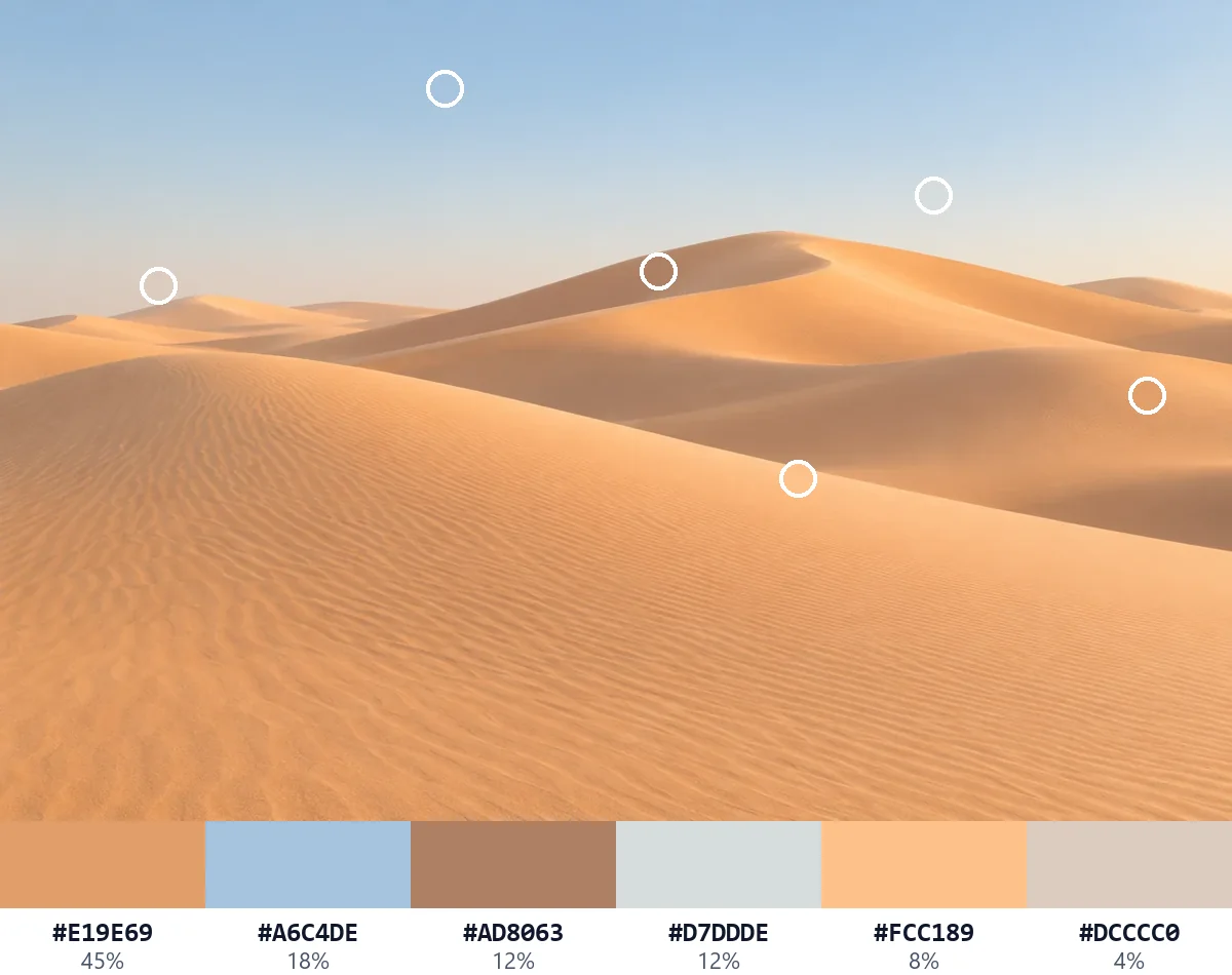
Each color shows how much of the picture it covers, so you know which one to use as the base and which as an accent.
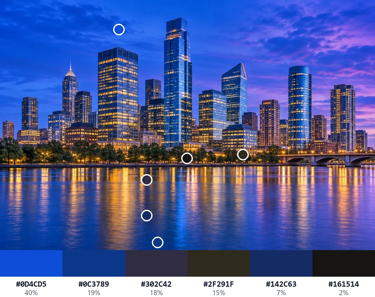
Set how many colors you want and sort them by share, by hue or by lightness. Leave out a plain background with one switch.
Copy the palette as HEX codes, CSS variables, SCSS, Tailwind or JSON, or download it for Adobe apps, Photoshop, GIMP, Inkscape and Krita, or as a PNG swatch card. No account and no limits.
A few habits for a color palette from image that works in a design.
Main shows what the picture is mostly made of. Use the largest share as a background, the next ones for surfaces, and keep a small, strong color for buttons and accents.
Vivid suits posters and social posts, Muted suits interiors, packaging and calm brands, Light suits backgrounds and print, and Dark suits night themes and dark mode.
When the palette misses a color you love, drag the nearest mark onto it. Only that color changes, and the shares are worked out again.
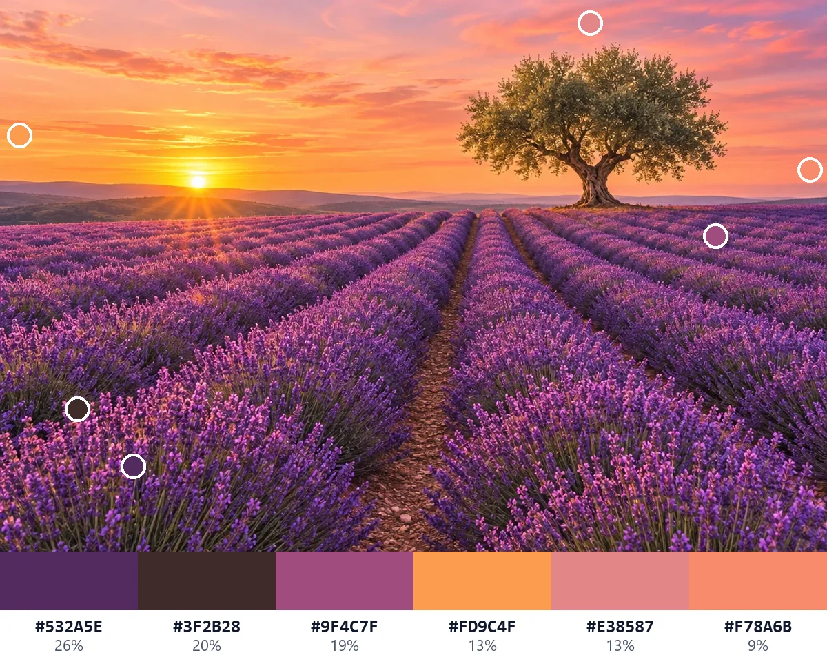
Click a color in the list to see its contrast as text on white and on black. For body text, aim for AA, a ratio of 4.5:1 or more.
Most designs use three to six colors. Start with five, then add one only when the design needs it.
Anyone who wants colors that already work together, taken from a picture they like.
Turn a mood photo into a UI palette with CSS variables and Tailwind colors.
Take the palette of a reference photo or painting and keep it for a new piece.
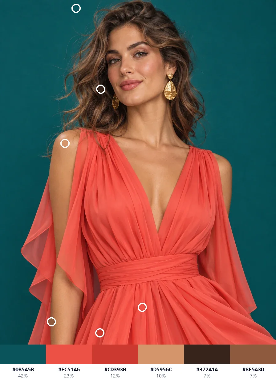
Match an outfit, a room or a wedding scheme to the colors of a photo.
Build a consistent look for posts, stories and brand kits from one picture.
Answers about palettes, moods, privacy and files.
Open the picture and the palette appears at once: its main colors, each with its share. Choose a mood and how many colors you want, then copy the codes or download the palette. A color palette from image files takes seconds.
Yes. It is free to use, with no sign-up, no watermark and no limit on palettes or downloads.
No. The picture is opened and read on your own device, and the palette is worked out in your browser. Once the page has loaded, it even works offline.
Main picks the colors that cover most of the picture. Vivid picks its strongest colors, Muted its softest, Light its palest and Dark its deepest. Every color still comes from the picture itself.
Yes. Drag that color's mark on the picture to another spot and the palette takes the color there. You can also click any spot to pick a single color.
From 3 to 12. Five or six is a good start for most designs, and flat logos and illustrations may hold fewer colors.
Copy the palette as a HEX list, CSS variables, SCSS, Tailwind or JSON, or download an Adobe swatch file (.ase), Photoshop swatches (.aco), a palette for GIMP, Inkscape and Krita (.gpl) or a PNG swatch card.
Photos and artwork with clear areas of color: landscapes, interiors, products, fashion and illustrations. A plain backdrop can be left out with one switch.
Open a picture and copy its palette in seconds, free in your browser.
Open a picture